Taste Is the New Prompt: Why AI Posters Still Need Human Art Direction
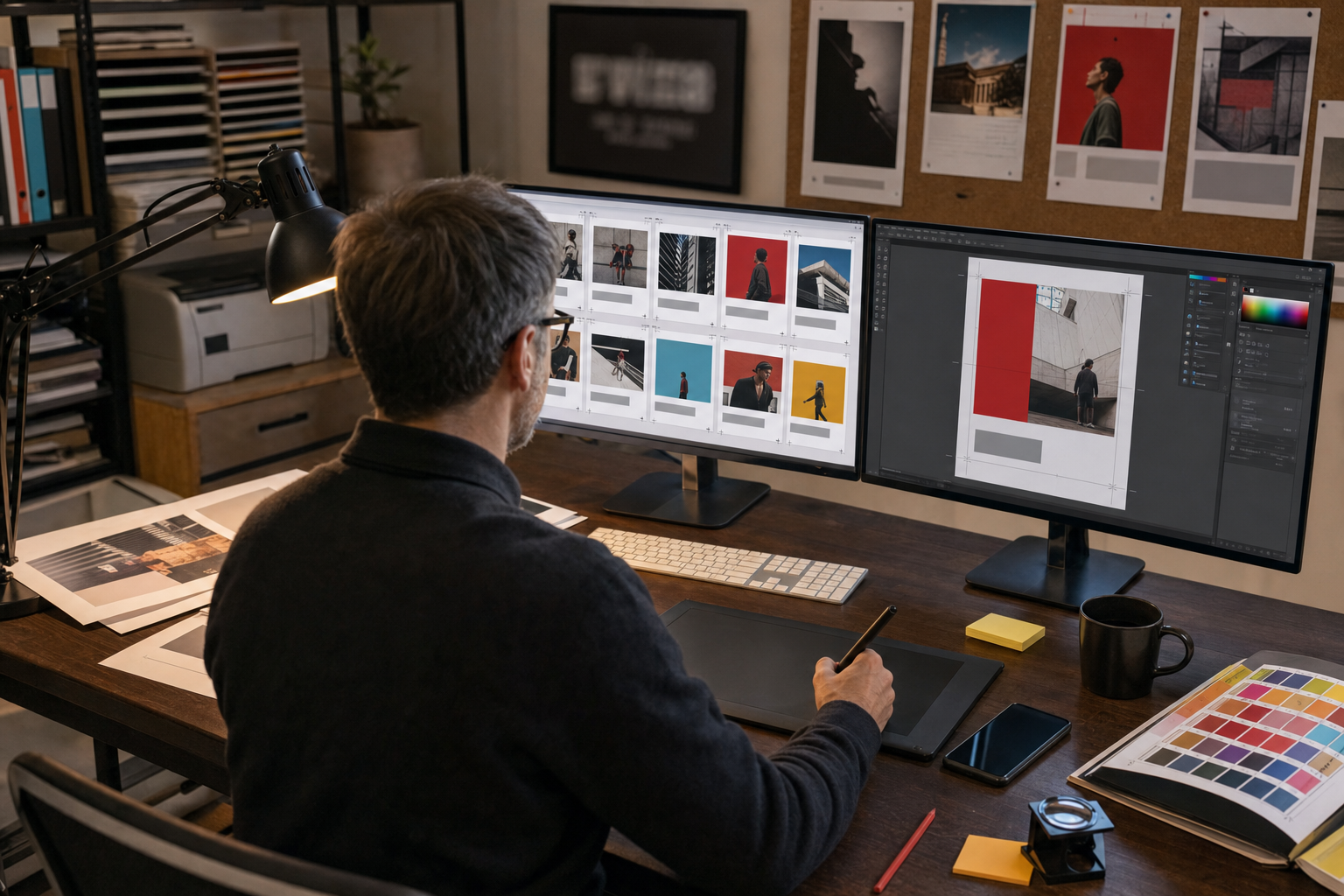
A recent online discussion, including a widely shared Hacker News thread arguing that “AI-generated posters don’t have to be horrible,” captured a real shift in creative work. Newer image models are better than earlier ones at composition, style matching, and short text rendering, so poster mockups that once looked obviously broken can now look surprisingly competent at first glance. That matters because posters are not a niche format. They sell films, announce concerts, promote startups, advertise local events, and carry political messages. If AI can generate them quickly, it changes expectations for designers, clients, and creative teams.
But the main debate is not whether the tools can make prettier pictures. It is whether good poster design is becoming automatic. The answer, at least for now, is no. A poster succeeds or fails on hierarchy, typography, editing, and intent. Those are judgment problems, not just generation problems. The tension is simple: as image models improve, does human craft matter less, or does it matter more? In practice, better models raise the floor. They do not remove the need for art direction.
This is not a benchmark, but it is a useful signal
The current excitement around AI posters is based mostly on public examples, experiments, and debate, not on a formal industry study. That is worth stating clearly. A viral thread is not proof that poster design has been solved. But it is still a useful signal. It shows that the visual gap between “AI image” and “usable draft” is shrinking fast enough for working creatives to pay attention.
The factual change is easy to see: some models now produce cleaner layouts, more coherent visual styles, and short headlines that are at least readable. The interpretation is harder: this can create the impression that poster design is mostly a prompting task. My view is the opposite. The easier image generation becomes, the more obvious the remaining human work becomes.
A poster tests more than image quality
Poster design looks simple from a distance. It is not. A poster has to catch attention, set a mood, and deliver key information very quickly. Usually it must work in more than one setting: on a wall, in a subway station, on a phone screen, in a social media feed, and sometimes in print at very different sizes. A strong image helps, but it is only part of the job.
A poster is not just an image with words on top. It is a ranking of information.
That ranking is where many AI posters still fall apart. A model may generate an eye-catching background, but the event name is too small. Or the date blends into the color field. Or the overall mood says “luxury fragrance” when the client needed “student hackathon.” A music poster can get away with ambiguity. A conference poster usually cannot. If the time, place, price, or call to action is unclear, the design has failed even if the image looks impressive.
This is why posters are a better test of visual intelligence than many viral AI images. Concept art can survive on atmosphere alone. Posters cannot. They have to communicate.
What “taste” actually means in practice
“Taste” can sound vague or elitist, but in design it is usually practical. It means making better choices, and rejecting bad ones, before the audience ever sees the work. In poster design, that often comes down to a few concrete skills.
- Knowing what matters most. Is the star of the poster the event name, the performer, the date, or the image? Good art direction decides this early.
- Building hierarchy. The viewer should know where to look first, second, and third. Size, contrast, spacing, and placement do that work.
- Choosing type with purpose. A condensed sans serif for a tech summit sends a different signal than a distressed display face for a punk show. The choice should fit the message, not just look trendy.
- Using restraint. AI often produces too much: too much texture, too much glow, too many details, too many competing focal points. Taste is often the decision to remove.
- Matching the audience. A poster for an experimental gallery show can be harder to decode than a poster for a local food festival. Context changes the design rules.
This is where human direction still matters most. Models are good at producing options in recognizable styles. They are much worse at deciding which option fits the brief, which visual cliché weakens the message, and which detail will make the design feel cheap.
Why the revision loop matters more than the first prompt
The mythology around AI art still leans too heavily on the prompt, as if one clever sentence can replace a design process. In real projects, the value is usually in the revision loop. The first output may be useful, but it is rarely the final answer.
A more realistic workflow looks like this:
- Start with a one-sentence brief. What is the poster for, and what should someone understand in three seconds?
- Gather references. Not to copy them, but to define tone, pacing, color, and typography.
- Generate broadly. Use AI to explore several directions quickly instead of betting everything on one visual idea.
- Select and simplify. Keep one concept, cut the noise, and rebuild the structure around the message.
- Set the final type manually. Most professional teams still rely on design software for the finished text, spacing, logos, and production files.
- Test at real sizes. A poster should work both from a distance and in a small digital preview.
That workflow sounds less magical than “type a prompt, get a masterpiece,” but it is closer to how good work actually gets made. AI speeds up exploration. Human direction creates coherence.
Typography is still the dividing line
If there is one area where AI posters still reveal their limits, it is typography. Image models have improved a lot at short words and bold headlines, but posters often need much more than that. They need dates, names, ticket links, sponsor marks, venue information, legal text, and visual consistency across all of it.
Even small mistakes matter. A beautiful film poster with one awkward line break looks amateur. A concert poster with inconsistent letter spacing looks untrustworthy. A conference poster with the wrong date is useless. This is why many designers treat AI-generated type as a draft signal rather than final output. The image may come from AI. The finished language usually should not.
That may sound like a technical detail, but it is actually central to the argument. Posters are one of the clearest cases where communication design is more than image generation. The closer the work gets to real information, the more human precision matters.
The upside is real, especially for small teams
None of this means creatives should dismiss the tools. The upside is obvious. AI can help a solo designer explore ten visual directions before lunch. It can help a small nonprofit make a decent event poster without hiring an illustrator. It can help students learn by testing different moods, compositions, and references quickly. It can help art directors build stronger early concepts before moving into final production.
That speed matters. So does access. Many people have good visual instincts but limited drawing or image-making skills. AI can lower that barrier. Used well, it can widen participation in creative work rather than narrow it.
There is also a business advantage. Faster concept generation means more room for experimentation before a team commits budget to photography, illustration, or print. In that sense, AI can support better creative decisions rather than replace them.
The risk is generic abundance
The risk, however, is not only job loss or copyright disputes, though both are real concerns. The more immediate creative risk is sameness. If many people use the same models, the same prompt formulas, and the same trending aesthetics, visual culture starts to flatten. You see the pattern already: dramatic centered subjects, heavy texture, retro-futurist gradients, fake print wear, cinematic lighting, and a lot of visual noise pretending to be personality.
That is where human taste stops being a luxury and becomes a filter. When anyone can generate twenty plausible posters, the hard part is knowing which nineteen to reject. Without that filter, speed does not produce originality. It just produces more average work, faster.
There are also labor questions. If first drafts become cheap, some junior production tasks may shrink. That is a real pressure on the design pipeline. And legal uncertainty around training data and commercial rights remains unresolved in many cases. Creative teams should not ignore that just because the outputs look better than they did last year.
What good teams should do now
The most useful response is neither panic nor hype. It is discipline. Teams using AI for posters should be clear about where the tool helps and where human review is non-negotiable.
A simple checklist helps:
- What should the viewer notice first?
- Can the key information be read in a few seconds?
- Does the typography look intentional, not accidental?
- Is the design specific to this event, brand, or audience?
- What has been cut because it looked impressive but said nothing?
That last question may be the most important. AI is very good at producing visual surplus. Good art direction is the ability to reduce that surplus into something clear, distinct, and useful.
The larger lesson goes beyond posters. As creative tools get better, the bottleneck moves away from raw production and toward judgment. That is why taste is the new prompt. Not because prompting no longer matters, but because the real value now sits in selection, revision, typography, and point of view. A poster still needs someone to decide what it is trying to say, and what should be left out. The machine can generate options. The human still has to make the work mean something.